Common Widgets
All of the following are available via the common package
(import common as c).
Layout helpers
c.box(orientation, spacing=0, style=None) creates a Gtk.Box. Pass
'h' or 'v' for orientation:
row = c.box('h', spacing=10)
col = c.box('v', spacing=5, style='widget')
c.sep(orientation, style=None) creates a Gtk.Separator:
row.append(c.sep('v'))   # vertical rule between siblings
col.append(c.sep('h'))   # horizontal rule
c.label(text, style=None, ha=None, va=None, he=False, wrap=None, length=None)
creates a Gtk.Label. ha/va accept 'start', 'end', 'center',
or 'fill'. he=True makes the label expand horizontally (useful for
pushing other widgets to the right). wrap sets a max character width
for word-wrapping. length enables truncation with a hover tooltip for
the full text:
# Expands to fill remaining space
title = c.label('CPU', style='heading', ha='start', he=True)

# Truncated at 20 chars with hover tooltip showing full text
cmd = c.label(long_string, length=20)
c.level(min=0, max=100, value=0, style=None) creates a Gtk.LevelBar:
bar = c.level(min=0, max=100, value=round(percent))
bar.set_hexpand(True)
c.scroll(width=0, height=0, style=None) creates a basic
Gtk.ScrolledWindow. For most popover use cases the gradient scroll
boxes below are preferred.
Graph
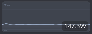
c.Graph is a Cairo drawing area that renders a scrolling line graph.
graph = c.Graph(
    data=[[0]],       # list of series; each series is a list of values
    state=42,         # current value shown as an overlay label
    unit='%',         # appended to the state label
    height=180,       # widget height in pixels
    width=300,        # widget width in pixels
    smooth=False,     # Catmull-Rom smoothing (slower, better for few pts)
    min_config=0,     # fixed y-axis minimum (None = auto)
    max_config=100,   # fixed y-axis maximum (None = auto)
    colors=[(0.3, 0.6, 0.9)],  # one RGB tuple per series
)
Pass multiple series to overlay them on the same graph:
graph = c.Graph(
    data=[history_core0, history_core1, history_core2],
    colors=self.get_colors(3),
    ...
)
Call update_data in update_ui to push new values without rebuilding
the widget:
pw['graph'].update_data(
    [data['history']],   # same shape as the constructor's data
    round(data['total']) # new state value
)
Optional constructor parameters:
| Parameter | Default | Description |
|---|---|---|
secondary_data | None | A second data series drawn as vertical pill bars |
hover_labels | [] | Per-point strings shown in a tooltip on hover |
time_markers | [] | Data-point indices where a vertical dashed line is drawn |
time_labels | [] | Labels for each time marker |
icon_data | [] | Per-point icon strings; a FA icon is drawn at each change |
pin_first_to_edge | False | Pin the first data point to x=0 |
center_in_bins | False | Centre each point in an equal-width bin |
PillBar
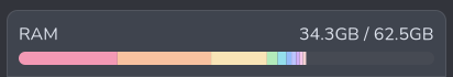
c.PillBar is a Cairo drawing area that renders a segmented, rounded
bar suitable for showing a percentage breakdown (e.g. memory by process).
bar = c.PillBar(
    height=12,       # bar height in pixels
    radius=6,        # corner radius
    wrap_width=None, # max chars for hover tooltip wrapping
    hover_delay=0,   # ms delay before hover tooltip appears
)
Call update to set the segments. Each segment is a dict with
percent, color, and an optional tooltip:
bar.update([
    {'percent': 40.0, 'color': (0.95, 0.74, 0.69), 'tooltip': 'firefox'},
    {'percent': 20.0, 'color': (0.56, 0.63, 0.75), 'tooltip': 'python3'},
    {'percent': 10.0, 'color': (1.0, 1.0, 1.0),   'tooltip': 'Other'},
])
percent values are relative to the full bar width (i.e. they should
add up to at most 100). Segments that would be less than 0.5 px wide
are skipped. Hovering over a segment shows its tooltip in a small
popover.
VScrollGradientBox / HScrollGradientBox
These wrap a child widget in a Gtk.ScrolledWindow and overlay
edge-fade gradients to signal scrollable content. They also animate a
brief flash when the user tries to scroll past the end. This is
similar to how the built-in ScrolledWindow class works, but
provides a more customizable gradient.
c.VScrollGradientBox scrolls vertically:
vsgb = c.VScrollGradientBox(
    child,               # any Gtk widget
    height=250,          # fixed viewport height in pixels (0 = unconstrained)
    max_height=None,     # soft maximum; widget expands up to this height
    width=400,           # fixed viewport width in pixels (0 = unconstrained)
    gradient_size=None,  # fade band size in pixels (default: 30)
)
c.add_style(vsgb, 'box')
c.HScrollGradientBox scrolls horizontally:
hsgb = c.HScrollGradientBox(
    child,
    height=0,
    max_width=None,
    gradient_size=None,
)
Both classes expose ._scroll (the inner Gtk.ScrolledWindow) if you
need to swap the child after construction:
vsgb._scroll.set_child(new_content)